1
2
3
4
5
6
7
8
9
10
11
12
13
14
15
16
17
18
19
20
21
22
23
24
25
26
27
28
29
30
31
32
33
34
35
36
37
38
39
40
41
42
43
44
45
46
47
48
| <!DOCTYPE html>
<html lang="en">
<head>
<meta charset="UTF-8">
<title>js</title>
<style>
.base-coupons {
width: 600px;
height: 300px;
margin: 250px auto;
position: relative;
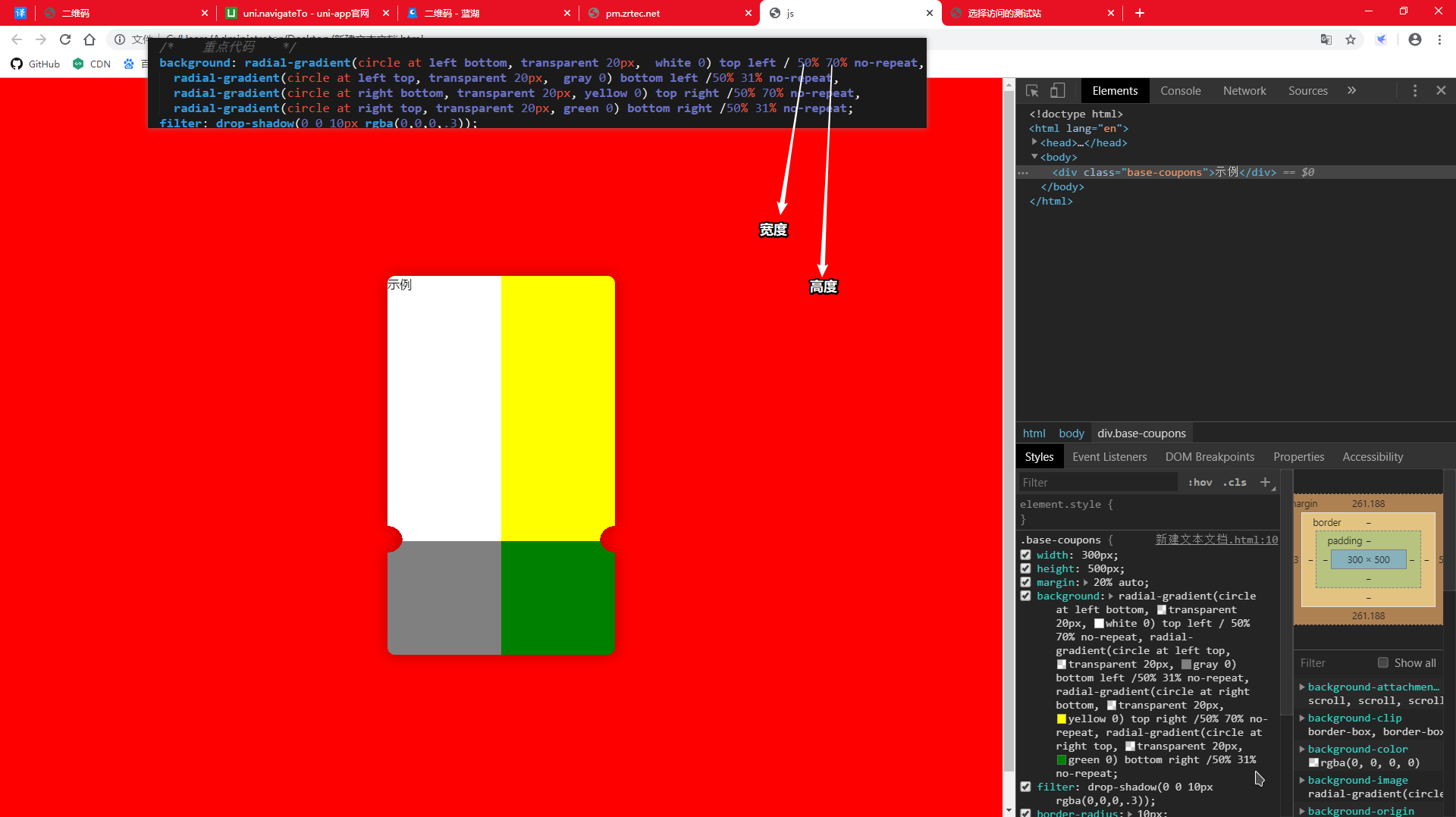
background: radial-gradient(circle at right top, transparent 10px, red 0) top left / 30% 51% no-repeat,
radial-gradient(circle at right bottom, transparent 10px, red 0) bottom left /30% 51% no-repeat,
radial-gradient(circle at left top, transparent 10px, blue 0) top right /70% 51% no-repeat,
radial-gradient(circle at left bottom, transparent 10px, blue 0) bottom right /70% 51% no-repeat;
filter: drop-shadow(3px 3px 3px rgba(0,0,0,.3));
}
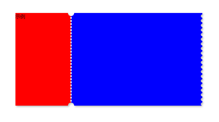
.base-coupons::before {
content: '';
height: 270px;
border: 2px dashed white;
position: absolute;
left: 30%;
top: 0;
bottom: 0;
margin: auto -2px;
}
.base-coupons::after {
content: '';
position: absolute;
height: 100%;
width:5px;
top: 0;
right: -5px;
background-image: linear-gradient(to bottom, blue 5px, transparent 5px, transparent),
radial-gradient(10px circle at 5px 10px, transparent 5px, blue 5px);
background-size: 5px 15px;
}
</style>
</head>
<body>
<div class="base-coupons">示例</div>
</body>
</html>
|